Tuesday, April 12, 2011
Photojournalism Ethics
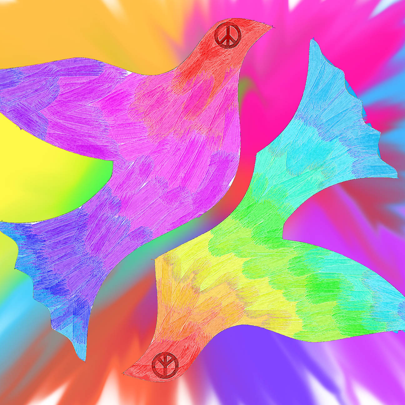
Media has evidently evolved throughout the years. Nowadays, people have seen so much, and are less conservative. Even so, there should still be some rules and boundaries laid. Rules are always created to keep everything under control. Therefore, rules and the code of ethics are necessary to avoid anyone from getting hurt or disrespected by the pictures that are taken. Every time someone takes a picture, it can be used to portray a certain message and as a reporter or journalist, it is their job to do so. However it is important how and when they do this. Respect for the subject should be taken into consideration when taking pictures of them, and how the public will react to the picture as well. Manipulation of images can be useful in making the picture look better and portraying the message more effectively, however manipulating the images can also be misused to alter the truth or mislead the public. It is also difficult to tell if you crossed the lines of intrusion and shocking images. Today, paparazzi are all over celebrities, following them wherever they go, and making big bucks off the pictures they take. But when is too much too much? I think that this is where respect and consideration come in place. Even though celebrities should be used to people following them, there is always a time and place for everything. These celebrities are also just normal people trying to live their lives. Which images are to graphic or shocking? Movies like Saw and Texas Chainsaw Massacre are well known for their goriness. So is it okay to show a picture of a man with his leg cut off because of war? As long as the message is reached and portrayed respectively, then the media should be allowed. All it comes down to is respect and consideration of the subject's feelings. Also, if the message has been effectively portrayed, then that is enough. There is no need to go over board with bloody or gory images.
Thursday, April 7, 2011
No vote, No voice

I chose some words that I thought represented or were connected to voting. I wanted something that would be quick and simple to read. The word "VOTE" stands out in the black and white background and therefore attracts the eye. The poster is simple, quick, and easy to look at.

I wanted to use something that would represent Canadian voting only, therefore I decided to use a picture with someones face with the Canadian flag painted on her face. I clone stamped the person's mouth to erase it, symbolizing "no voice." The words "NO VOTE, NO VOICE" is a quick and easy to remember message. It is strong and makes you think beyond than just what is written. If you don't vote, you are wasting your right to say something, to speak up, to have an opportunity to make a change. I wrote the phrase "no vote" in smaller sized font so that it shows that you really don't have a voice if you don't vote.

This poster also represents Canadian Voting. It shows the Parliament Buildings because it not only represents Canada it also represents our government and Canadian politics. "Your country, Your voice, Your vote" is the message I chose to portray because Canada is our country and it is our responsibility to speak up if we want to be heard and make a change, and voting is a right given to us to do so.

This poster is just a simpler version of the previous. Instead of having the Parliament Buildings as a distraction from the main message, I chose to right the message within the picture. The simplest picture that could could symbolize Canada is the maple leaf. This way, nothing takes attention away from the main focus: the message "Your Country, Your Voice, Your Vote." I chose to put these words in the colours red and white to also symbolize the Canadian flag.
Sunday, April 3, 2011
Express Yourself: 2011 OLOL Poetry Book Cover
I wanted the cover to be vibrant and full of colour. I started off with some ideas including, a bucket of paint, paint splatter, and an open mind with colours flowing out.
I decided to look for some pictures on the internet, and thought of the iPod silhouettes.

Then I used the magic wand tool to erase the orange background. I also added black paint
splatter on the top. Then I used the grass paintbrush tool to paint grass in black.

Next, I added the titles using the text tool. I chose white, so that it would stand out in the dark colour of the grass, and used a nice clear font.

Lastly, I used different colours to create the background.

I was contemplating on whether to use the multi-coloured background or just the plain white background. I decided to use the colourful one because it allowed the cover to be more eye catching and unique rather than plain and boring.
I used the iPod silhouette because it would catch the eye of the audience, high school students. Most people, if not all, would recognize the image. I thought it was simple and clear. I used the colourful background rather than the white one, because I thought colours could represent expression. I think the cover overall is not too much. It is not too crowded and there isn't alot going on, so that it portrays simplicity but also expression.
Friday, April 1, 2011

Thursday, March 31, 2011


Thursday, February 17, 2011
Digital Potrait
DIGITAL PORTRAITS: Black and White: "Violence Hurts" Manipulated: "Frustration" and "Opened Blindness"
"VIOLENCE HURTS"

I took the photo from the cafeteria, where there was sunlight shining on one side of her face. I asked Kathy to do different poses for my ideas such as blindness, violence, and sadness. I already used one of her poses for the blindness and I thought this pose looked very interesting and had the most effective lighting.
I did minimal changes to the photo. First, I cropped it and changed the contrast. Finally, I converted it to black and white. Because, there was a distraction in the photo, I had to erase and clone stamp that part to eliminate it from the photo.

I feel that even though very little change was done to the picture, the outcome was good and effective. I do find that sometimes, less is more, and that simple changes can make the photo look interesting. Sometimes, doing too much just ruins the goal you are trying to reach.
"FRUSTRATION"

At first, I was not sure of who my subject was, and what I wanted them to do. I had a lot of trouble with this first step. Ms. Reidel helped me by thinking of some friends that would be interesting to take a picture of. I chose Catherine Subang to be my subject. I took a couple of pictures of her with different emotions. I also took a picture of Steven Nguyen, but decided to use Catherine's pictures instead.


Once I decided which picture of Catherine to use, I cropped it to make it look more interesting.
Then, I played around with the shadow and highlights.
I also changed the mid-tone contrast of the picture to add more effect.
Then, I finally converted the picture to black and white.

Lastly, I played around with the brightness and contrast of the picture to create the final product.
I was satisfied with the overall outcome of "Frustration." I liked how simple it was, and how I did minimal effects to it. By converting the picture to black and white, it created an entirely new image. It added impact to the picture.
"OPENED BLINDNESS"

I had a lot of fun manipulating this photo, but I didn't want to to overdue it. The first thing I did was crop the photo and filled the background with black paint to cover up any blank parts. Next, I converted it to black and white and played around with the brightness, contrast, shadows, and highlights. Then, I used the magnetic lasso to select her eyes. I changed the brightness and contrast. I also added a new layer over each eye and painted it a light blue. Then, I changed the opacity of the blue layer to make it fit with the eye. I also blurred it to make it blend more effectively.
I was very satisfied with the overall outcome. My goal wasn't to make it look creepy or scary, but it turned out that way. Nevertheless, I like the effect and impact the picture has. A quote that inspired me to do this photo was "God closed my eye, and now I can see." In a movie, a blind man said this quote, and I think it had a good message. Even though you may be blind, sometimes you can see more. You can see things in the world that you would not normally pay attention to if you were not blind.

"VIOLENCE HURTS"

I took the photo from the cafeteria, where there was sunlight shining on one side of her face. I asked Kathy to do different poses for my ideas such as blindness, violence, and sadness. I already used one of her poses for the blindness and I thought this pose looked very interesting and had the most effective lighting.
I did minimal changes to the photo. First, I cropped it and changed the contrast. Finally, I converted it to black and white. Because, there was a distraction in the photo, I had to erase and clone stamp that part to eliminate it from the photo.

I feel that even though very little change was done to the picture, the outcome was good and effective. I do find that sometimes, less is more, and that simple changes can make the photo look interesting. Sometimes, doing too much just ruins the goal you are trying to reach.
"FRUSTRATION"

At first, I was not sure of who my subject was, and what I wanted them to do. I had a lot of trouble with this first step. Ms. Reidel helped me by thinking of some friends that would be interesting to take a picture of. I chose Catherine Subang to be my subject. I took a couple of pictures of her with different emotions. I also took a picture of Steven Nguyen, but decided to use Catherine's pictures instead.


Once I decided which picture of Catherine to use, I cropped it to make it look more interesting.

Then, I played around with the shadow and highlights.

I also changed the mid-tone contrast of the picture to add more effect.

Then, I finally converted the picture to black and white.

Lastly, I played around with the brightness and contrast of the picture to create the final product.

I was satisfied with the overall outcome of "Frustration." I liked how simple it was, and how I did minimal effects to it. By converting the picture to black and white, it created an entirely new image. It added impact to the picture.
"OPENED BLINDNESS"

I had a lot of fun manipulating this photo, but I didn't want to to overdue it. The first thing I did was crop the photo and filled the background with black paint to cover up any blank parts. Next, I converted it to black and white and played around with the brightness, contrast, shadows, and highlights. Then, I used the magnetic lasso to select her eyes. I changed the brightness and contrast. I also added a new layer over each eye and painted it a light blue. Then, I changed the opacity of the blue layer to make it fit with the eye. I also blurred it to make it blend more effectively.
I was very satisfied with the overall outcome. My goal wasn't to make it look creepy or scary, but it turned out that way. Nevertheless, I like the effect and impact the picture has. A quote that inspired me to do this photo was "God closed my eye, and now I can see." In a movie, a blind man said this quote, and I think it had a good message. Even though you may be blind, sometimes you can see more. You can see things in the world that you would not normally pay attention to if you were not blind.

Monday, February 14, 2011
Digital Landscape

DIGiTAL LANDSCAPE: "Alone" by Geline Quintano
My inspiration for this project were the black and white pictures that were shown by Ms. Reidel on the slideshow. I was also inspired by the digital landscapes created by Jim Kazanjian. At first, I decided to use a desert and some type of overlay. Then, I was going to create an interesting background and use broken buildings to fill in the bare space of the desert.
Instead of using a desert as my main photo, I used a picture of a lake at night with a foreground of a drought. I did this by deleting the water portion of the lake picture and replacing it with a new layer of the drought picture.


Next, I decided to put a hole in the ground. I did this by getting a picture of a hole from Google, and pasting it on to the drought layer. I blurred the edges and changed the colour slightly, to make it blend well with the drought layer.


By using Jim Kazanjian as an inspiration, I decided to take some pictures of some broken buildings and incorporate it into the picture. I took seperate buildings and pasted them close together to make it appear as one building. I also had to change the perspective and skew the picture so that it was on a certain angle to make it look realistic.


For the sky, I decided to lower the transparency of the actual sky of the lake picture, so that the picture of the earth I used can show through. I also added a rainbow to the sky because it seemed to add a little more detail.

The foreground of the picture seemed too bare. First, I pasted a ladder in the hole to make it seem like it was coming out of it. I had to play around with the perspective and skew tools to transform the ladder. Later on, I decided not to use the ladder because I was not satisfied with the outcome. Instead, I found a picture of a man who was ice fishing and pasted it near the hole. I changed the brightness and contrast of the man, and also blurred the picture to make it blend well with everything else.
I added a black cat just to balance the picture out. There was already something on the right side of the picture, and nothing on the other side. By adding the cat, it prevented the picture from being bare on the left side.
I converted the picture to black and white because I thought it would create a darker mood to the picture. The title of this digital landscape is Alone because the picture creates a dark and sad mood and it shows a man all alone.
Overall, I was happy with the outcome. I liked this digital landscape more than the previous ones that I have created in Grade 11. I think what I needed to work more on was the lighting and shadows of the picture.
EXTRA TIME: Other filters on the Original Photo
Accented Edges:

Mosaic Tiles:

Liquify:

Subscribe to:
Posts (Atom)